C’MUN rebrand
| August 21, 2016
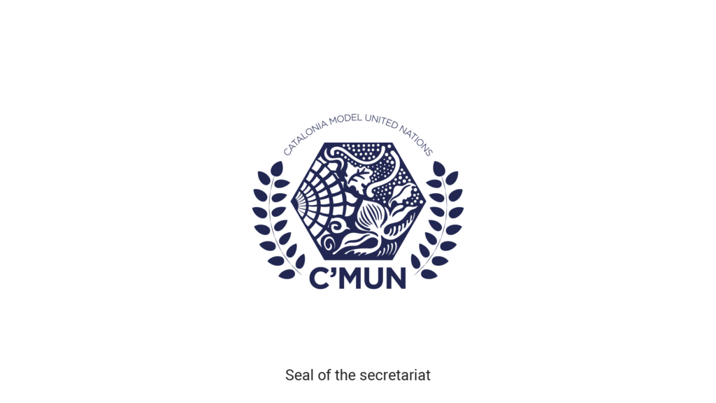
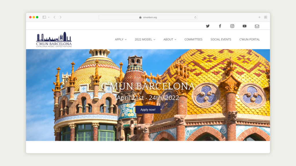
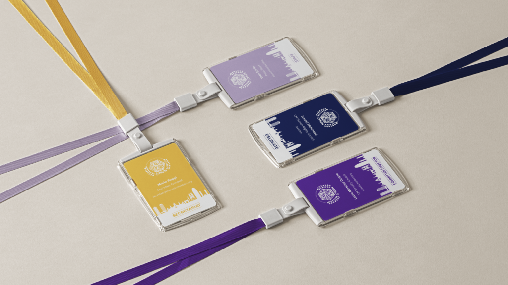
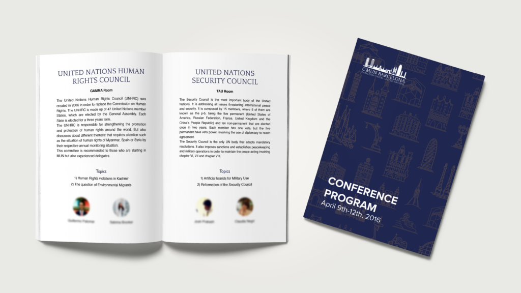
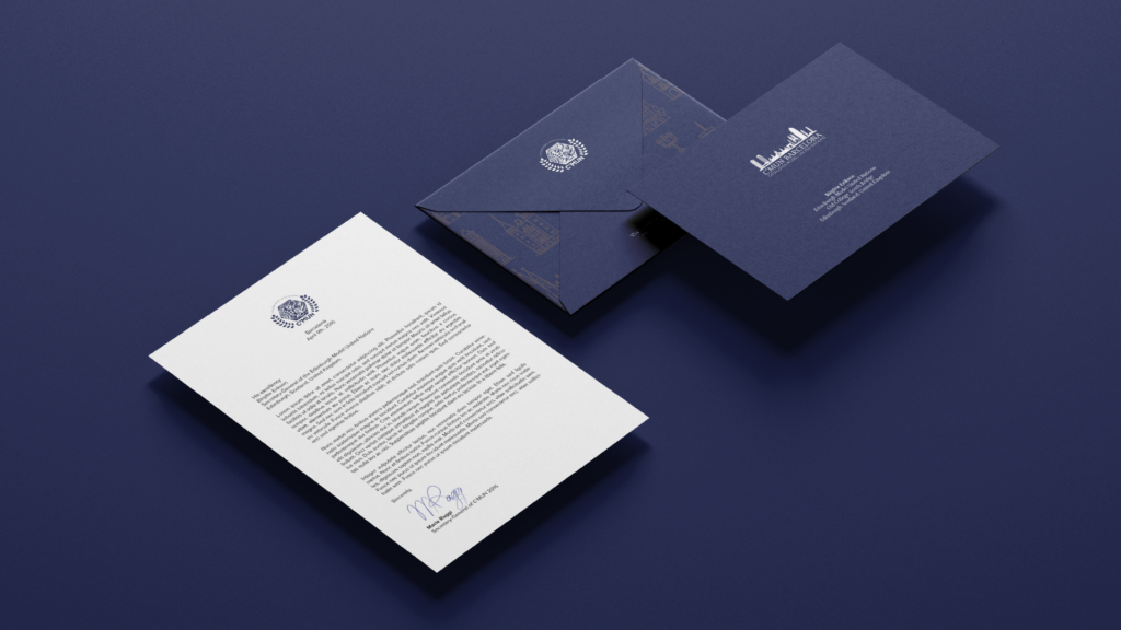
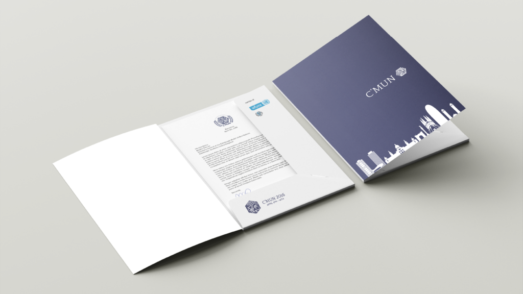
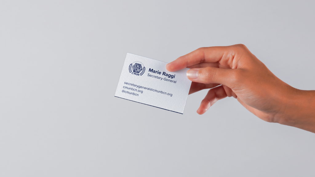
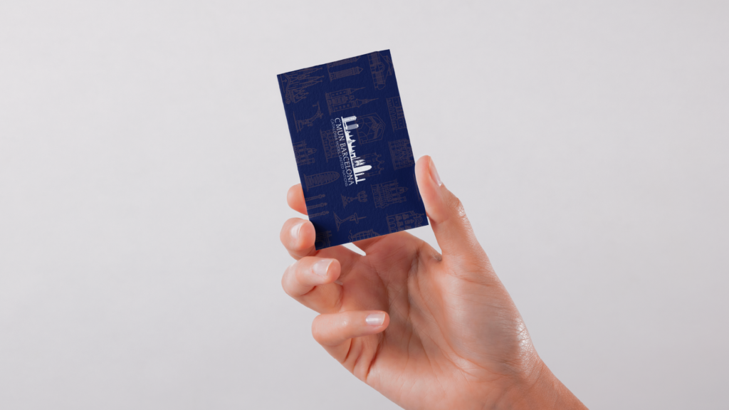
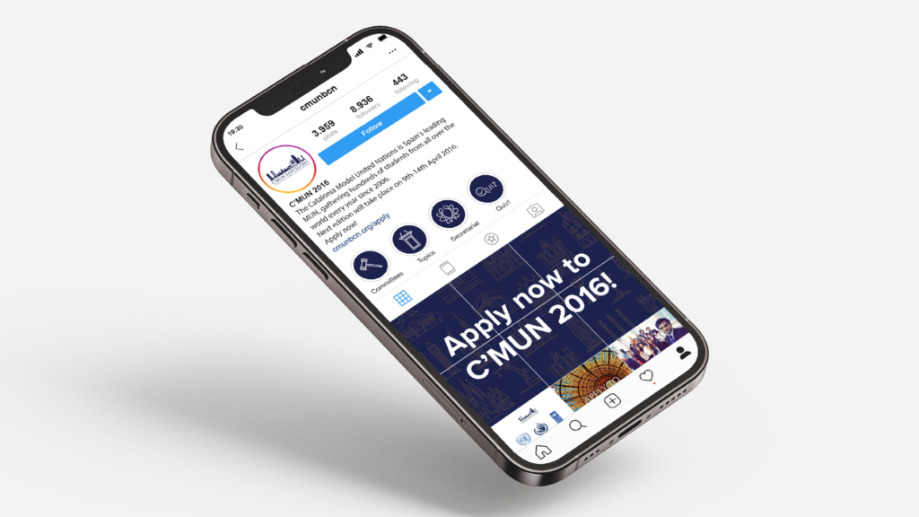
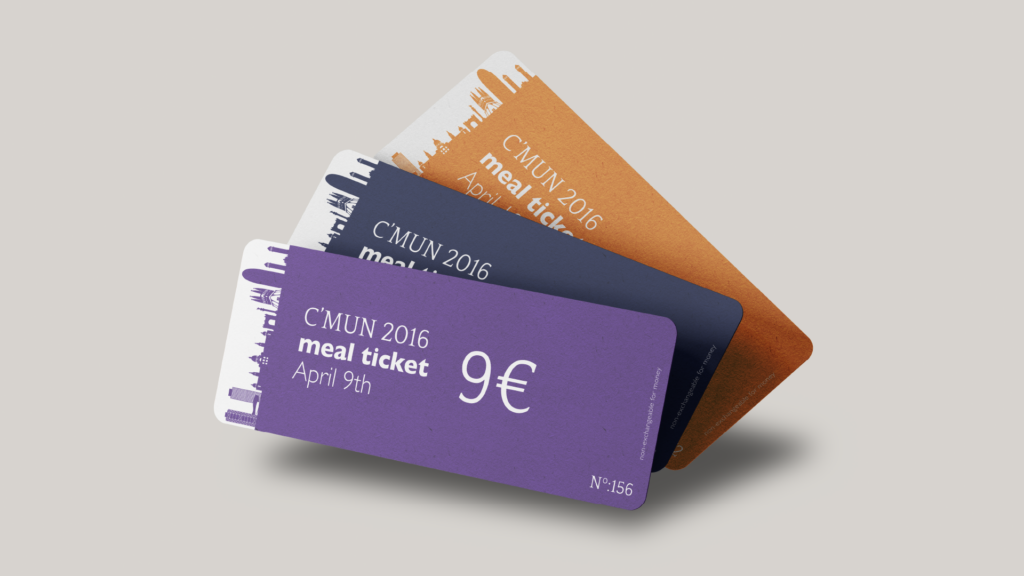
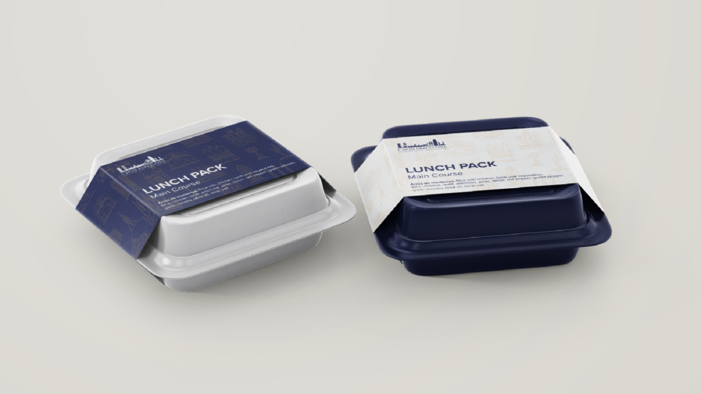
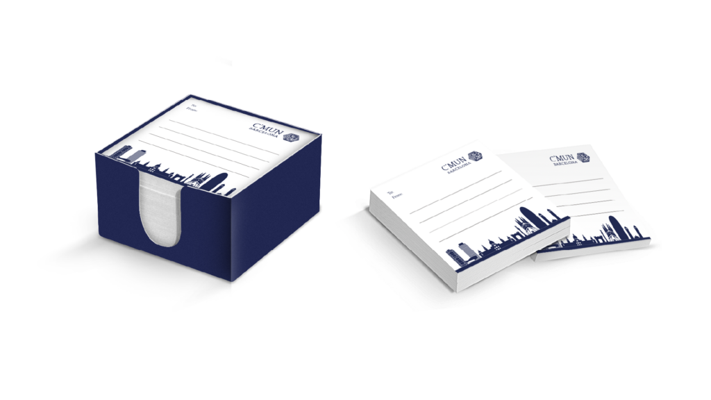
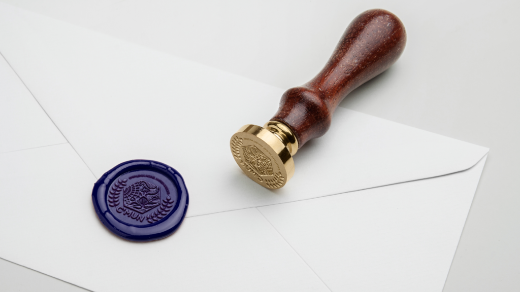
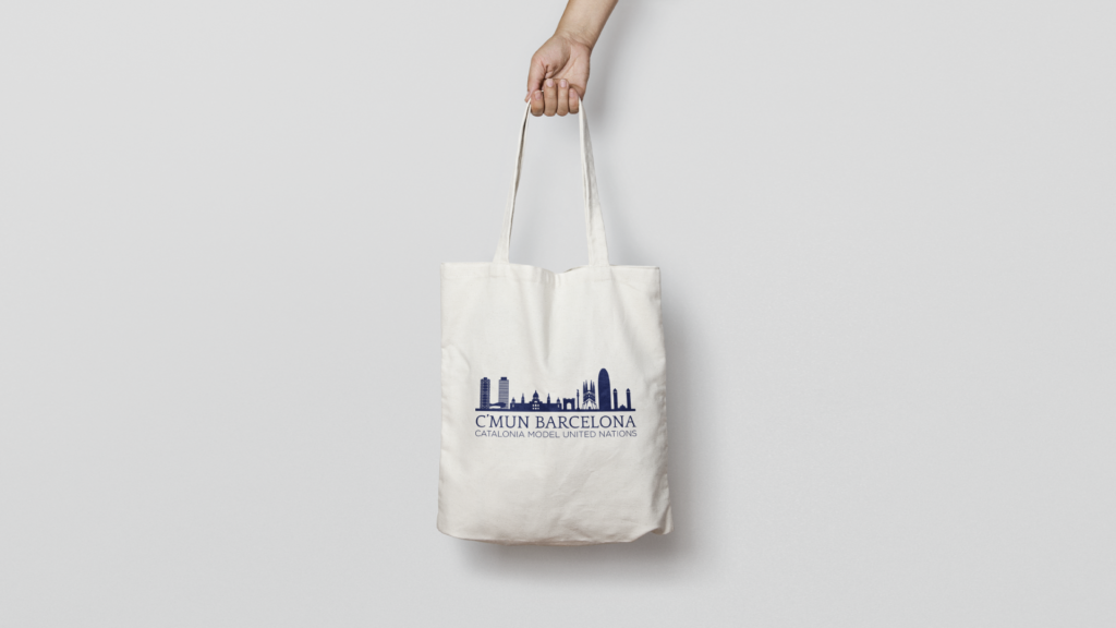
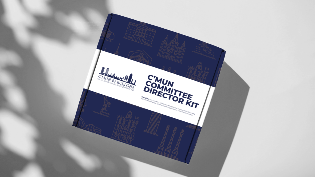
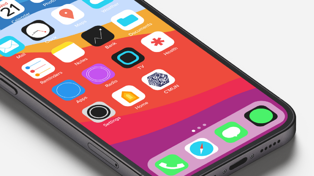
Between 2015 and 2016, during my first year in the conference team, the Catalonia Model United Nations (C’MUN) underwent a full rebranding strategy to modernise its image and to give cohesion to the publications, merchandise, and other conference materials. The United Nations Association of Spain, the main organiser of the conference, wanted the conference’s logo to be inspired by the skyline of Barcelona. In addition, we created a seal to represent the secretariat and each committee (see these). The new brand colour of C’MUN is navy blue #222751 and the font is Google font’s Quattrocento, which gives the brand a classic and institutional feel.